Disclaimer: This article has been written with the help of the ModSquad Community. The related live session is available here:
# Introduction
Hi, fellow developers!
After learning how to create micro frontends with Angular and React, we’re jumping into another world with Vue.js. Remember, we’re trying to create a micro frontend using the web component specifications for each of the following frameworks: Angular, React, and Vue.js.
Does Vue provide the best developer experience when creating a micro frontend social card? Let’s try it!
# Create the Vue.js app
First, ensure that you have installed Node with npm (you can use Yarn instead) and Vue CLI: npm install -g @vue/cli
I suggest using the default option Default ([Vue 3] babel, eslint) to create the application by running the following command in your target folder: vue create vue-social-card
That should create a folder named vue-social-card that contains a fresh Vue.js project.
Please note that by default, the application is configured to include certain features, such as npm scripts to start your app and eslint to help you code.
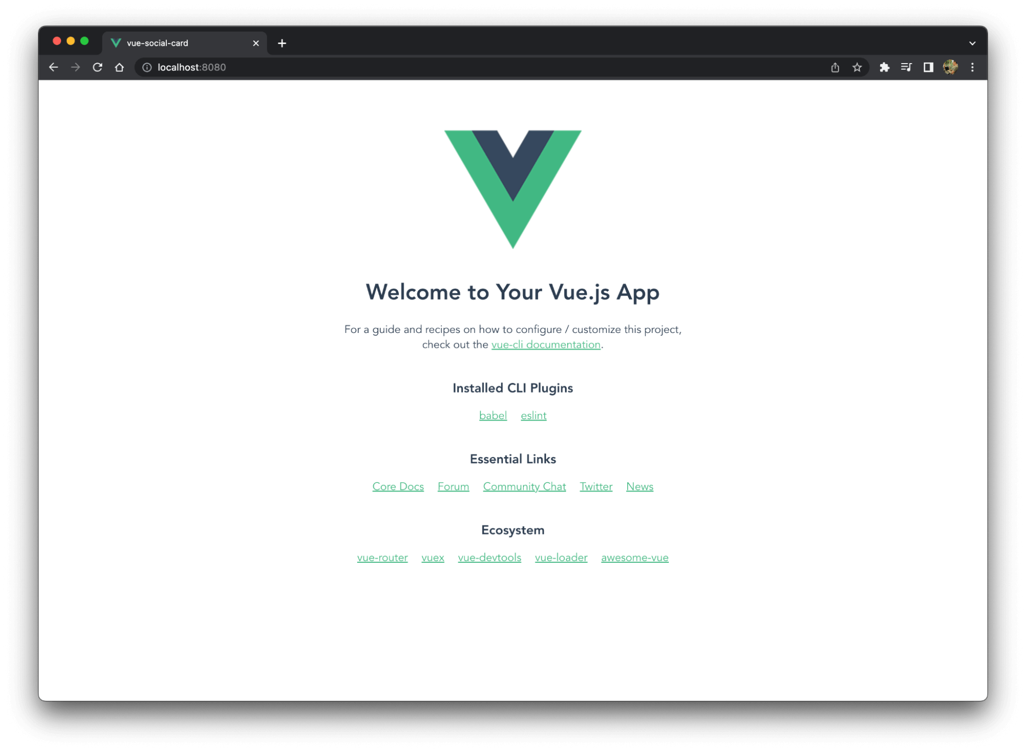
# Discover your application
Before making any changes and creating a micro frontend, let’s run the application locally using npm run serve. Your application should then be available at the following URL: http://localhost:8080/.
# Create the social card component
Vue.js helps you organize your code with components. That means we need to create a file to contain all the card code. You can delete the default file called HelloWorld.vue.
Once you’ve created a new file named SocialCard.vue in the components folder, copy the following code into it:
<script>
export default {
  props: {
    card: {
      type: Object,
      required: true
    }
  },
};
</script>

<template>
 <div class="card">
  <h2>{{ card.name }}</h2>
     <span>{{ card.description }}</span>
  <img :src="card.image" :alt="card.image_alt"/>
 </div>
</template>

<style>
.card {
width: 320px;
height: auto;
min-height: 450px;
background: rgb(60, 62, 68);
border-radius: 20px;
overflow: hidden;
padding: 10px 15px;
margin-bottom: 24px;
margin-right: 10px;
transition: all 0.2s linear;
cursor: pointer;
color: white;
}
img {
margin-top: 5%;
 max-width: 100%;
 height: auto;
}
.card:hover {
transform: scale(1.01);
box-shadow: 0 3px 12px 0 rgba(0, 0, 0, 0.2),
 0 1px 15px 0 rgba(0, 0, 0, 0.19);
}
.card > .title {
margin: 0;
}
</style>
Our component is just a simple piece of HTML/CSS code that requires an entry object named card and defines the following properties: name, description, image, and image_alt.
As it is, your application might be broken due to an error in the app.vue file. It’s time to update it.
# Update App.vue
The reason your app doesn’t work is that the main component still includes the default component. To fix it, replace the file contents with the following code:
<script>
import SocialCard from "@/components/SocialCard";

export default {
  components: {
    SocialCard
  },
  data() {
    return {
      shiba_card: {
        id: 1,
        name: 'Shiba Inu',
        description: 'The Shiba Inu is the smallest of the six original and distinct spitz breeds of dog from Japan.\n' +
            '      A small, agile dog that copes very well with mountainous terrain, the Shiba Inu was originally\n' +
            '      bred for hunting.',
        image: 'https://material.angular.io/assets/img/examples/shiba2.jpg',
        image_alt: 'The Shiba Inu image'
      },
    }
  }
};
</script>

<template>
  <SocialCard :card=shiba_card></SocialCard>
</template>
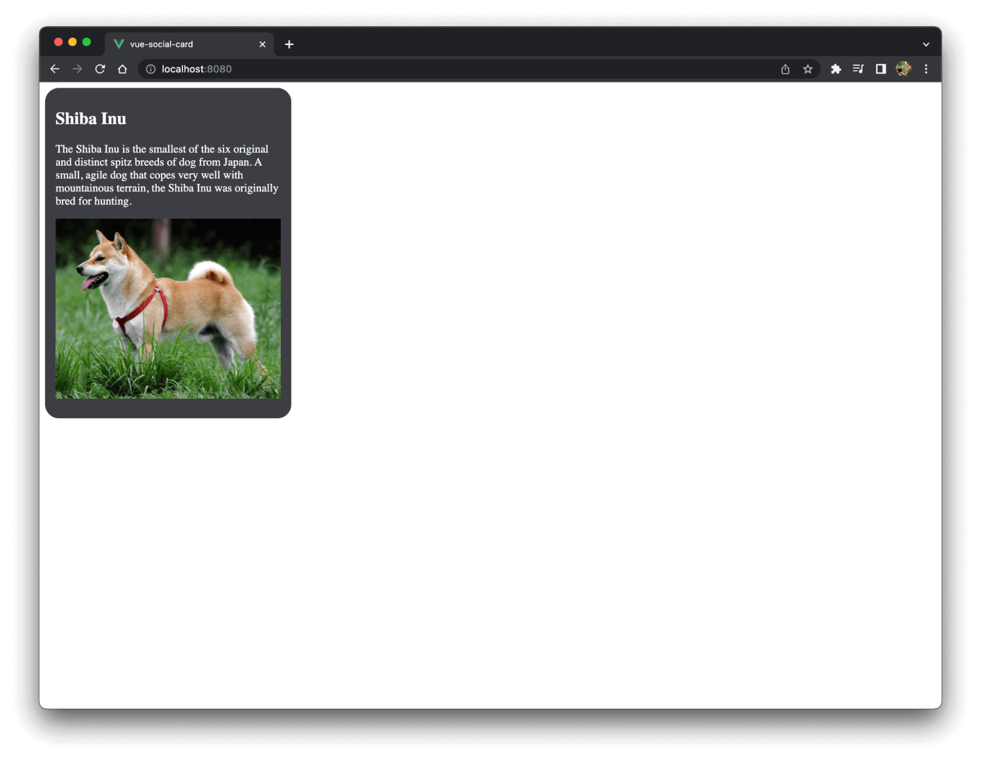
This imports our social card component, defines a card object shiba_card in the data() function to store the different properties, then passes the card object to the social card component in the template section.
The application is working again and the default Vue landing page is replaced with the Shiba Inu social card:
However, we only built a classic single page application and need to migrate it to a micro frontend.
# Define the custom element
In order to reuse this app as a web component, we need to define a custom element, which is a typical step when using Angular and React.
Replace the contents of the main.js file with the following:
import App from './App.vue'

import { defineCustomElement } from 'vue'

const SocialCardElement = defineCustomElement(App)

customElements.define('social-card-element', SocialCardElement)
This code defines the social-card-element custom element and wraps the Vue app. As we saw before, this app is now rendering the card as expected.
Next, replace <div id="app"></div> in the public/index.html file with the custom element:
<body>
 <noscript>
   <strong>We're sorry but <%= htmlWebpackPlugin.options.title %> doesn't work properly without JavaScript enabled. Please enable it to continue.</strong>
 </noscript>
 <social-card-element></social-card-element>
 <!-- built files will be auto injected -->
</body>
Congratulations! You have just built a Vue.js micro frontend using a custom element.
Please note, as I’m writing this article, there is an issue with styling and custom elements that is discussed in detail here. Please follow this ticket to know when it will be fixed or for current workarounds.
# Resources
The code above is available on GitHub here.
Thanks to this repo for the card example.
Are you already using Entando and looking for Vue.js components? Take a look at this sample.
Watch micro frontend videos on our YouTube channel.
Join us on Discord to share and learn about composable apps.